 type-invaders.com/duiker grotesk type-invaders.com/duiker grotesk |
|
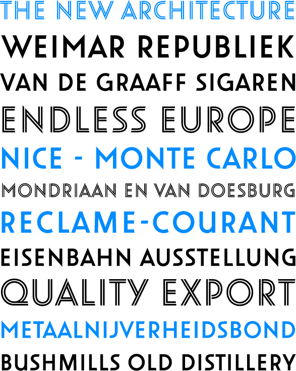
Duiker Grotesk is a typeface designed for the lettering of a monumental building in The Hague. This building, a former school called Duikers Derde Ambachtsschool, dates from 1929 and is designed by Jan Duiker in typical Bauhaus fashion. The building was acquired in the mid-nineties by a group of architects who wanted to preserve it as a monument. After the necessary funds were found renovation began and in 1998 the building was restored in its original splendour, almost exactly according to Duiker’s original specifications. Today it’s one of the most beautiful architectural monuments in The Netherlands. The Duiker Grotesk typeface was specifically designed for the lettering of the exterior and interior of the building. Its roots are firmly based in the architectural lettering of the beginning of the twentieth century, drawing inspiration from Art Deco and Bauhaus. But at the same time it is a design completely tailored to current needs and standards. Duiker Grotesk will become available for licensing at Bold Monday |

|